Our homework for the June City and Guilds class was knitting with colour; stranding, weaving in, and intarsia.
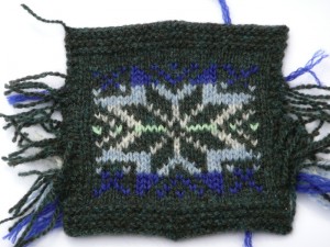
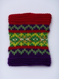
My first sample was an example of stranding:
I did this one by knitting flat, then at the end of each row, snipping the yarn and, after zooming the stitches along to the other end of the circular needle, re-joining the yarn so that I could knit the next row, rather than purling back. The pattern is a traditional one, sometimes called Norwegian star I think. The yarns are all 4ply weight Shetland, apart from the darker blue which is an oddment and I think is probably acrylic, I’m not sure where it came from actually. I enjoyed knitting the pattern but didn’t enjoy the fact that this method meant it was hard to get the first and last stitches of each row neat and not sloppy. In light of this I worked all my other stranded samples circularly. It may be bizarre but I would rather do twice as much knitting and have it neat 🙂
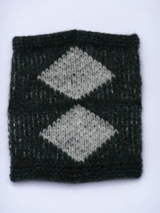
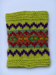
With the stranding the yarn is just held loosely at the back of the work when it isn’t being knitted. Our next sample was weaving in, where the non-working yarn is woven into the working yarn every other stitch in the same way that you would weave in yarn ends.
As you can see, the yarn being woven tends to show through to the right side. This is particularly obvious if, like I have, you have used yarns which contrast a lot in lightness and darkness. This does allow you to make large blocks of one colour while still knitting in the round with relative ease.
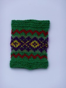
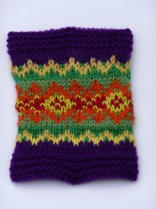
Next up, Fiona gave us a traditional pattern, and using the same selection of colours inspired from a picture, we had to colour in the pattern in a variety of different ways. My picture is of tulip fields in Holland 🙂
It really shows how a pattern can look different depending on the contrast between the background and the foreground. Value contrast really makes a difference. It is one of the problems I found with a couple of my samples, that I had put orange against green, and although they are very different colours, the particular shades I had chosen were very close in value. So if you photocopied them in black and white they would come out the same shade of grey. This means that particularly from a distance the pattern is not clear, and just looks rather blurry.
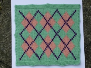
Lastly we did a couple of samples of intarsia. The first geometric, so I used an argyle pattern.
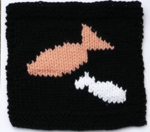
The second pictorial.
They are supposed to be fish.
These were all very enjoyable to do, it has been a long time since I did any intarsia and apart from tangling the yarns a bit it was all good fun. I am definitely going to do some colour work for my second project for the City and Guilds – I just need to get a move on with the first one! Speaking of which, I don’t think I have mentioned this on the blog yet. I will take some pictures as it already has most of a body and one sleeve.
Those all look SO fab! I love the pics and the colours you’ve used.
They are great!!!
I must go click the link about the City and Guilds….it sounds interesting 🙂
I love your Supercook socks too…..brilliant!!
Love
Sarah xXx